
Letterpress, photo by Joshua Stocker
Why Designers Should Know Typography
A Story About Webfonts And Forgotten Craft
When everything was printed, typography was a big deal. You even had people specialized in this.
Transitioning to the web, this art form was on the edge to be lost: we thought that it wasn’t that important. Now that we have fancy websites with fancy fonts, it’s making a comeback. Problem: everyone forgot how to do it right! Let me illustrate.
Last year, as the lead designer of a small R&D Team at Natexo Group, I accidentally heard an argument between one of my designer, a front end dev and our project manager.
The story
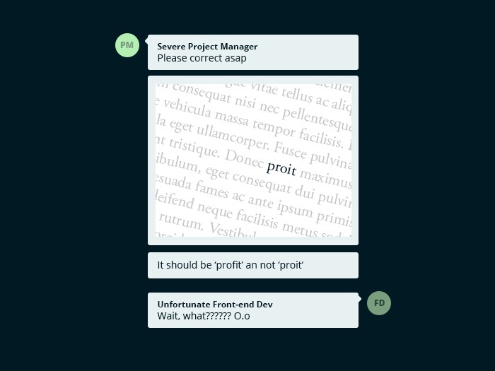
There was a typo on one of our client’s website. The word ‘profit’ appeared as ‘proit’.

Our unfortunate front end dev, who is at the bottom of the command chain, received all the blames. But he vigorously argued for his innocence :
«The error is not in my code!».
Overhearing the situation, and maybe excited by the strange bug, I took part in the discussion. After a while inspecting the code in my browser, I found out that the issue was with the Google Font used. Maybe I spoke too fast at that moment, because my designer hurried to find another font and replaced it in her design.
But it felt wrong. A buggy Google Font? Really? Where are we heading if we can’t rely on Google anymore?
I stayed longer facing my screen, trying to understand what we missed and then… Finally… I understood. The ligatures.
Ligatures? What’s That?
Yes, that’s the reaction my team had when I said the word. A term they didn’t hear in their whole life. And probably won’t remember the next morning.
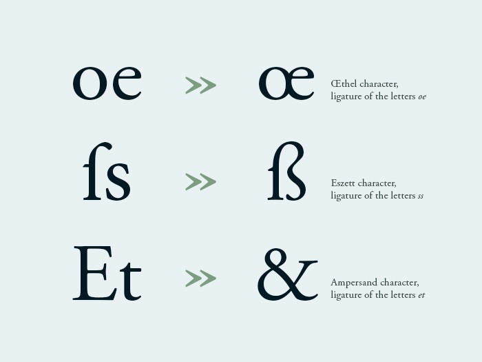
When two or more letters are combined in one character, you have a ligature.

Examples: « œ » in french, « ß » in german and the whole world with « & », yes! You didn’t know that the ampersand character is e and t combined, because « et » in latin means “and”
There are two type of ligatures :
Aesthetic ligatures: Because secluded monks were too lazy to lift their pen, they connected letters. We don’t use them much, optional stuff.
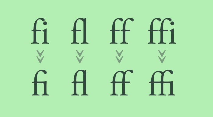
Technical ligatures: Legacy of the printing rules about readability, ligatures prevent two letters to collide on the paper. Especially with f.

Especially with f
Lost in Googlisation
So we ended up with a Google Font, lacking some ligatures. At this time, this issue wasn’t in the top ranking Google results, a longer exploration of the deep and dark dev blogs was requested.
I then discovered css attributes about ligatures. What a wonderful world we are living in.
-webkit-font-feature-settings: 'liga' 0, 'onum' 1, 'kern' 1;
-moz-font-feature-settings: 'liga' 0, 'onum' 1, 'kern' 1;
-o-font-feature-settings: 'liga' 0, 'onum' 1, 'kern' 1;
font-feature-settings: 'liga' 0, 'onum' 1, 'kern' 1;
font-feature-settings gives you access to a bunch of advanced typographic settings, among them: ligature!
With 0 , we chose to disable the automatic use of ligatures, which made the letter ‘f’ appear again. Victory is mine!
Conclusion
If you take a look at History of Web Typography, you can only notice improvement. Since Google launching his own font library in 2010, to this font-feature-settings attribute, that allows all typography fanatics to greatly improve the readability of their web texts. Ligatures, swashes, fractions, kerning, etc. All these and more are in your power, at the tip of your fingers. Implying you have the right typeface to play with and that you master typography. And that’s the real issue.
The delicate and sensible art of typography is not teached to designers anymore (or not well), lots of them don’t even know how to play with the Opentype features in Photoshop.
And don’t expect front dev to save the situation by knowing an obscure css attribute.
Certainly, you end up with a bunch of employees ready to start again from scratch just because they didn’t understand an issue.
So did we lose a generation of designers to the typography cause?
---
Want to learn more about font-feature-settings value? Try here.